Case study · Dental clinic
Dentora: A Calm, Booking-First Site for a Modern Dental Clinic
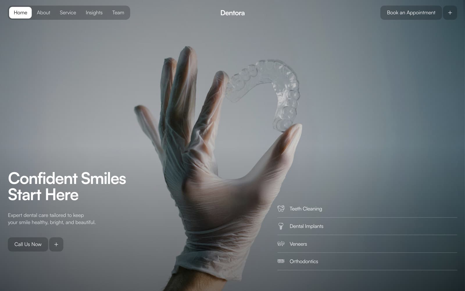
A calm, booking-first dental clinic site where Book an Appointment is never more than one tap away.
- Client
- Dentora
Context
The client
Dentora is a modern dental clinic. Most dental websites compete on volume — stock smiles, flashing offers, every service shouting at once — which is exactly the wrong tone for a patient who is already nervous about the appointment.
The challenge
What had to change
The site had to reassure first and sell second, while still making booking the easiest thing to do on every page. It also needed room for content that answers patient questions before they call, without slowing the site down.
Approach
How we approached it
Set a cinematic, unhurried visual pace — generous space, soft palette, no pop-ups — so the site feels like the clinic should.
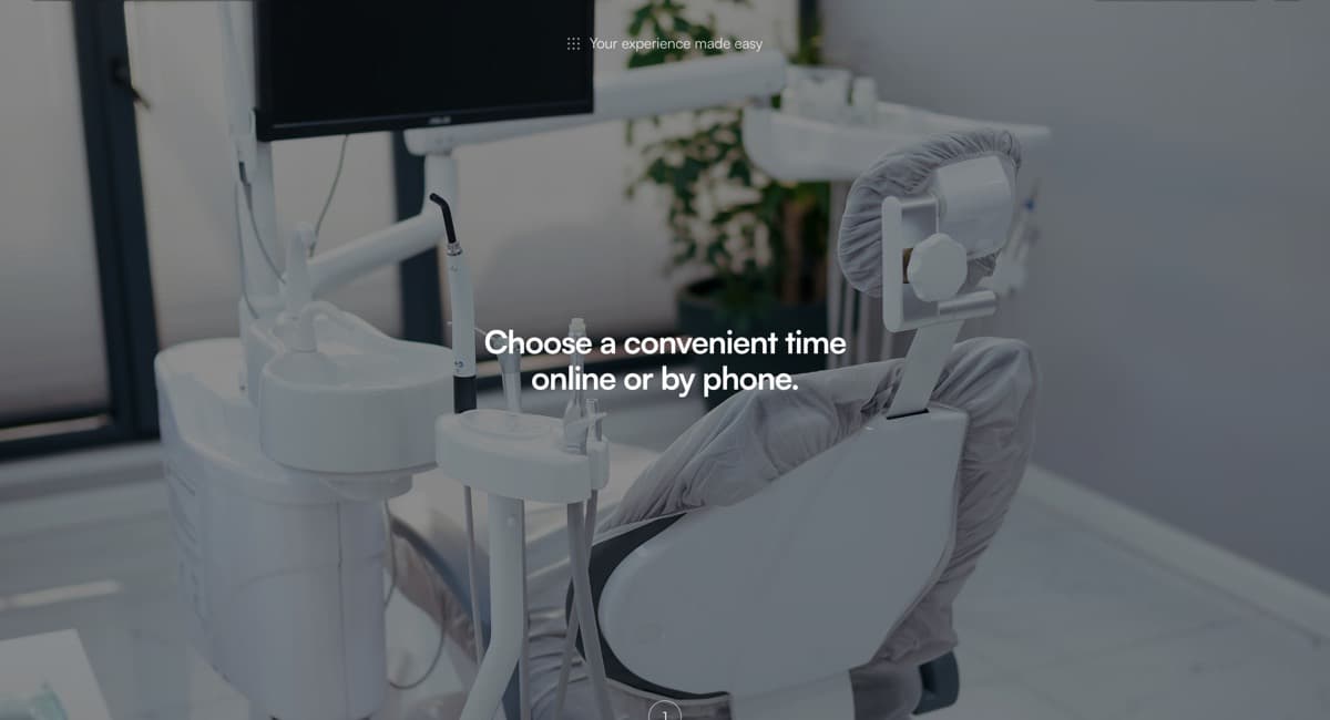
Kept Book an Appointment persistent on screen, so every page, from a service to an FAQ, ends in the same action.
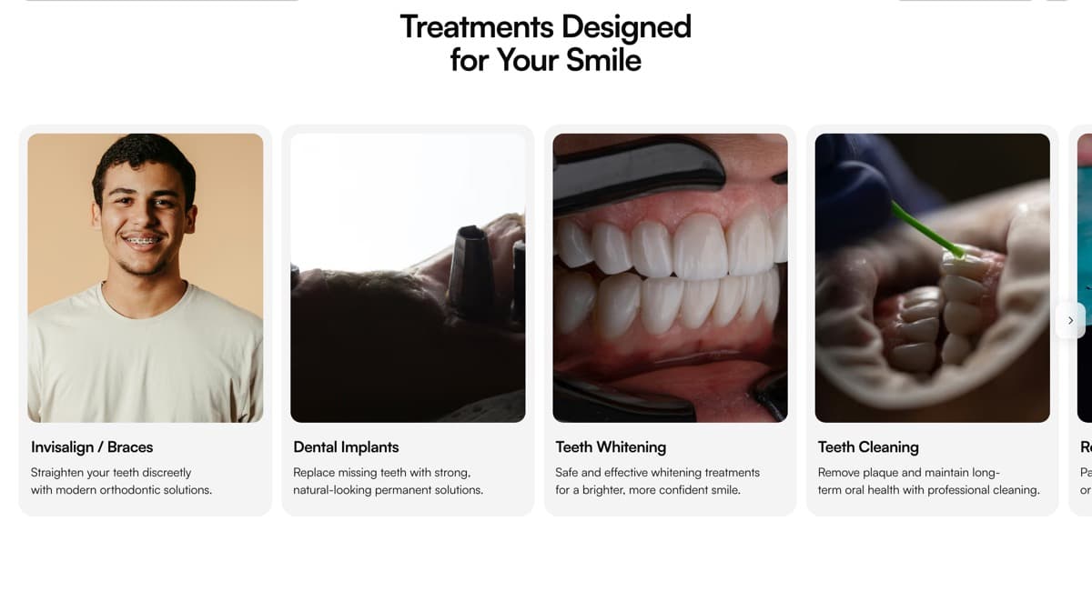
Organised the site around the questions patients actually ask: services, specialists, what to expect, and FAQs.
Built without an animation library — motion is CSS plus one shared observer — keeping shared first-load JavaScript around 99 kB.
What we built
Delivered
Home, services, team, about and contact pages
Persistent booking call-to-action and booking form
Insights articles, statically generated
Patient FAQ
Local SEO foundations: metadata, sitemap, structured pages
Technology
- Next.js 15
- React 19
- TypeScript
- Tailwind CSS v4
Deliverables
- Website design
- Website dev.
- Booking flow
- Motion
- Content
- Local SEO
Services used
Services on this project
More on how we work with this kind of business: dental clinic websites.
- Service
Website Design
Mobile-first websites designed around a single decision — book, order, enquire or buy — with the copy and structure to support it.
Read more - Service
Website Development
Fast, production-grade business websites with booking, ordering, WhatsApp and payment integrations, on a codebase you own.
Read more - Service
Local SEO & Google Business Profile
Google Business Profile, consistent listings, local pages and reviews: the signals that decide who appears on Maps nearby.
Read more
More work
Related projects
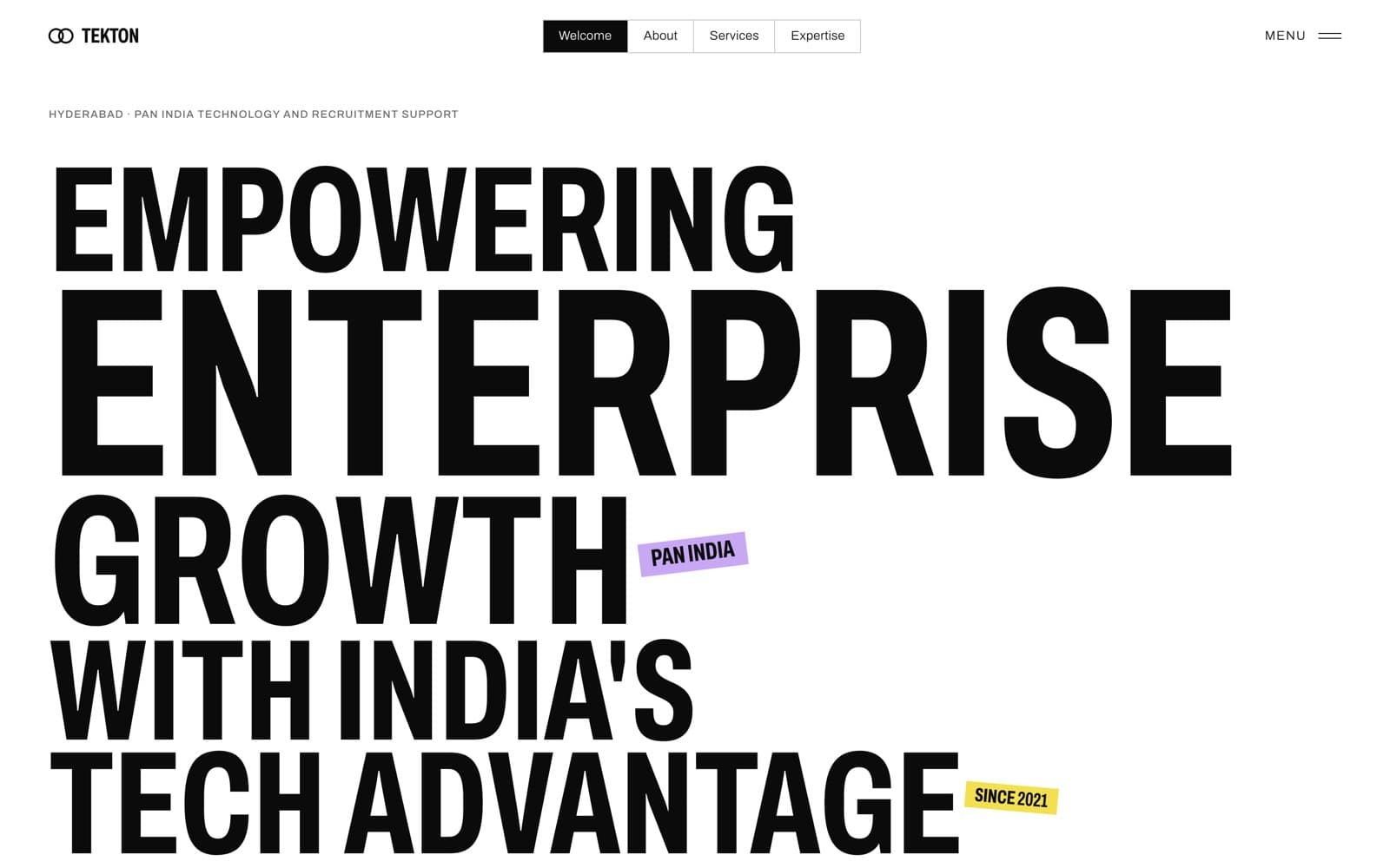
Recruitment & IT services · Hyderabad
Tekton Talent Solutions
A full rebuild of a tech-recruitment firm's Wix site as a type-led Next.js site that states the offer on the first screen.
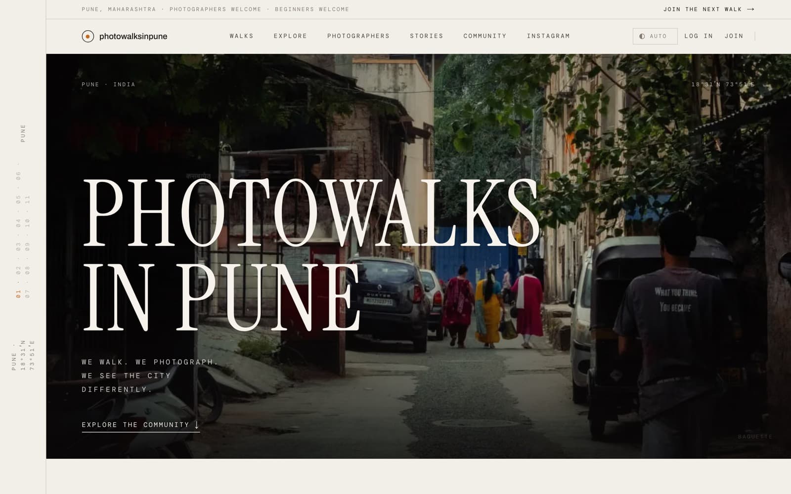
Community & photography · Pune
Photowalks in Pune
A home for a Pune photo-walk community: walks calendar, member accounts, photographer pages and a credited photo archive.
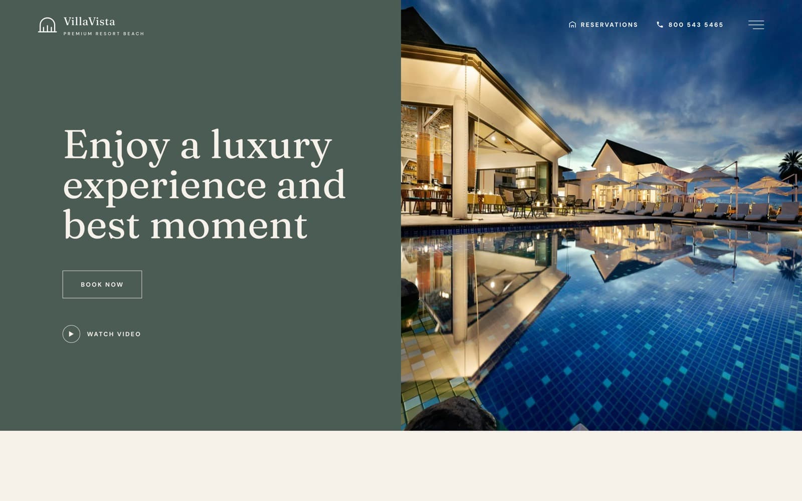
Hospitality — resort
VillaVista
A luxury resort site built to earn the direct booking — rooms, dining and grounds, with reservations reachable from anywhere.
Want something like this?
Tell us about your business — the first strategy call is free.